纯CSS3制作带有立体效果的导航菜单.docx
《纯CSS3制作带有立体效果的导航菜单.docx》由会员分享,可在线阅读,更多相关《纯CSS3制作带有立体效果的导航菜单.docx(9页珍藏版)》请在冰豆网上搜索。
纯CSS3制作带有立体效果的导航菜单
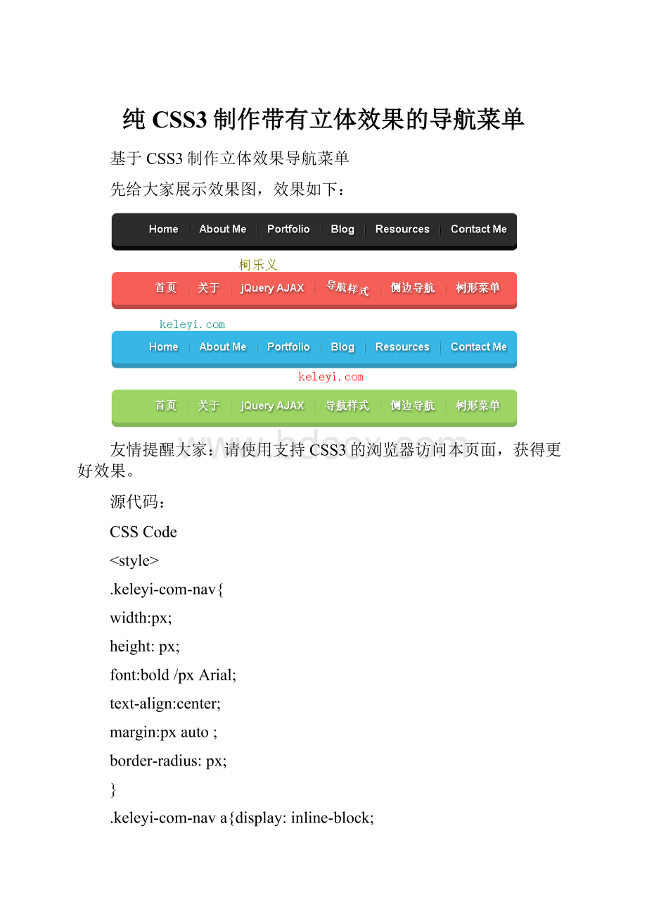
基于CSS3制作立体效果导航菜单
先给大家展示效果图,效果如下:
友情提醒大家:
请使用支持CSS3的浏览器访问本页面,获得更好效果。
源代码:
CSSCode
HomeAboutMePortfolioBlogResourcesContactMe
首页关于jQueryAJAX导航样式侧边导航树形菜单
HomeAboutMePortfolioBlogResourcesContactMe
首页关于jQueryAJAX导航样式侧边导航树形菜单下面给大家分享使用css3和伪元素制作的一个立体导航条
CSSCode
doctypehtml>
CSS制作立体导航
HomeAboutMePortfolioBlogResourcesContactMe