SAS画图 学习笔记.docx
《SAS画图 学习笔记.docx》由会员分享,可在线阅读,更多相关《SAS画图 学习笔记.docx(12页珍藏版)》请在冰豆网上搜索。
SAS画图学习笔记
SAS画图
、
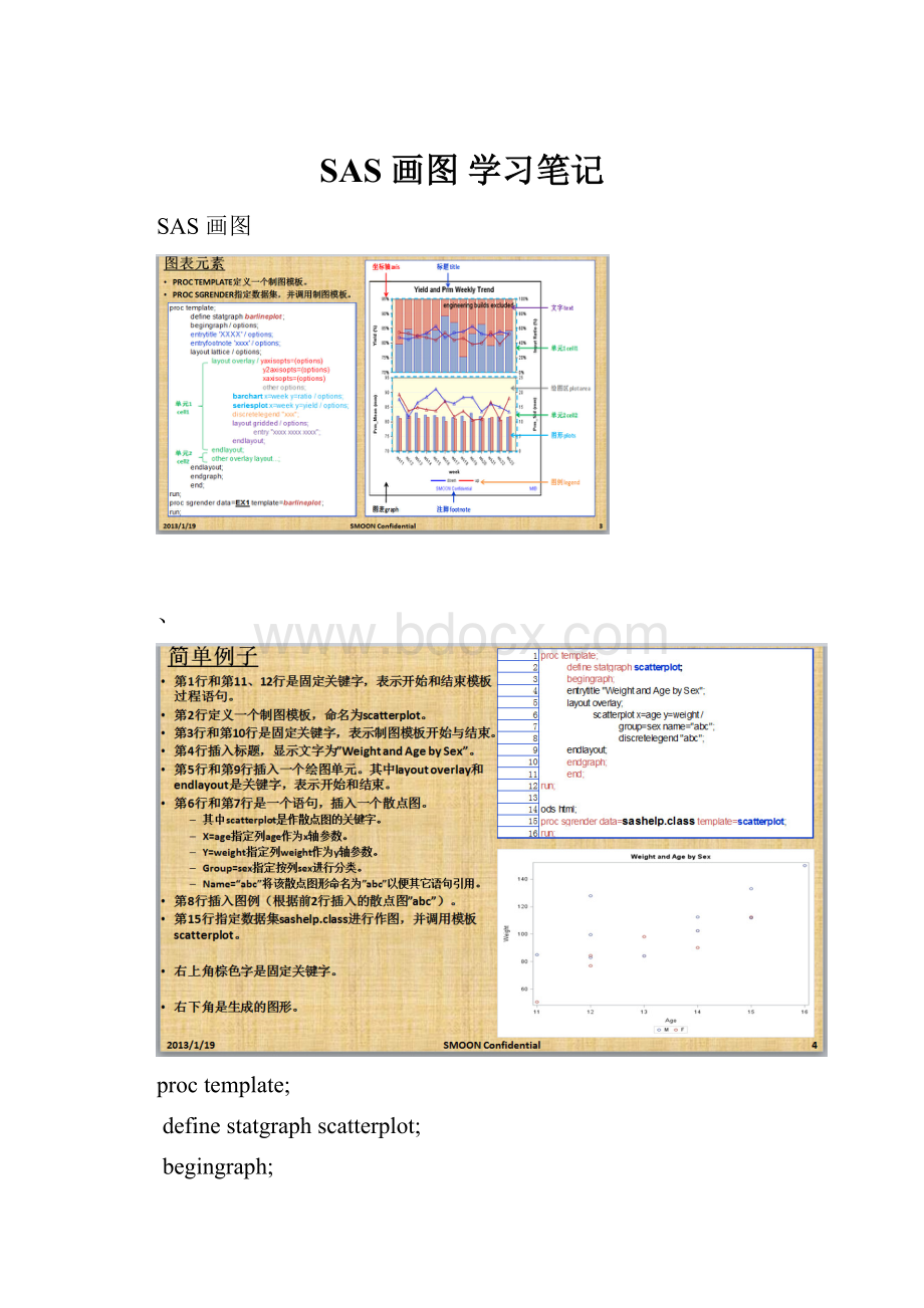
proctemplate;
definestatgraphscatterplot;
begingraph;
entrytitle"WeightandAgebySex";
layoutoverlay;
scatterplotx=agey=weight/
group=sexname="abc";
discretelegend"abc";
endlayout;
endgraph;
end;
run;
odshtml;
procsgrenderdata=sashelp.classtemplate=scatterplot;
run;
proctemplate;
definestatgraphscatterplot;
begingraph;
entrytitle"WeightandAgebySex";
entrytitlehalign=left"WeightandAgebySex"
/border=true*是否加边框,ture是加,false是不加;
opaque=true*透明度;
backgroundcolor=lightgreen*背景的颜色;
textattrs=(color=blue
family='Arial'
size=14
style=italic
weight=bold);*文本的格式;
entryfootnotehalign=center'SMOONConfidential'
halign=right"MIB";
layoutoverlay;
scatterplotx=agey=weight/
group=sexname="abc";
discretelegend"abc";
endlayout;
endgraph;
end;
run;
odshtml;
procsgrenderdata=sashelp.classtemplate=scatterplot;
run;
从图形可以看到,设置backgroundcolor=lightblue后,背景颜色变成淡蓝色了;设置border=true和borderattrs=(color=pinkthickness=3)后,边框变成粉红色并且加粗了;设置designwidth=400px和designheight=400px后,图表大小改变并且变成正方形了;设置pad=(bottom=50right=50)后,下边和右边空白区域变大了。
proctemplate;
definestatgraphscatterplot;
begingraph/backgroundcolor=lightblue
border=true
borderattrs=(color=pinkthickness=3)
designwidth=400px
designheight=400px
pad=(bottom=50right=50);
entrytitle"WeightandAgebySex";
layoutoverlay;
scatterplotx=agey=weight/
group=sexname="weight";
discretelegend"weight";
endlayout;
endgraph;
end;
run;
odshtml;
procsgrenderdata=sashelp.classtemplate=scatterplot;
run;
对比上下2个图形,可以看到设置aspecratio=0.7后,绘图区域形状变了;设置cycleattrs=true后,图形颜色从2种颜色变成4种颜色。
proctemplate;
definestatgraphseriesplot;
begingraph/designwidth=360pxdesignheight=260px;
entrytitle"TechStockTrends";
layoutoverlay/yaxisopts=(label='price')
aspectratio=0.7
cycleattrs=true;
seriesplotx=datey=close/group=stockname="stocks"
lineattrs=(thickness=3);
seriesplotx=datey=high/group=stock
lineattrs=(thickness=3);
discretelegend"stocks";
endlayout;
endgraph;
end;
run;
procsgrenderdata=sashelp.stockstemplate=seriesplot;
wheredate>"31dec1999"dandstock^='IBM';
run;
对比上下2个图形,可以看到设置opaque=true和backgroundcolor=lightyellow后,布局背景颜色变成淡黄色;设置border=true和borderattrs=(color=bluepattern=dashthickness=2)后,布局区域显示边框,并且边框属性为蓝色、破折线、加粗;设置pad=(top=50)后,布局上方和图表距离变大了;设置wallcolor=lightgray和walldisplay=(fill)后,绘图区域背景颜色变成淡灰色。
proctemplate;
definestatgraphseriesplot;
begingraph/designwidth=360pxdesignheight=260px;
entrytitle"TechStockTrends";
layoutoverlay/yaxisopts=(label='price')
aspectratio=auto
backgroundcolor=lightyellow
border=true
borderattrs=(color=bluepattern=dashthickness=2)
cycleattrs=true
opaque=true
pad=(top=50)
wallcolor=lightgray
walldisplay=(fill);
seriesplotx=datey=close/group=stockname="stocks"
lineattrs=(thickness=3);
seriesplotx=datey=high/group=stock
lineattrs=(thickness=3);
discretelegend"stocks";
endlayout;
endgraph;
end;
run;
procsgrenderdata=sashelp.stockstemplate=seriesplot;
wheredate>"31dec1999"dandstock^='IBM';
run;
从图形对比左右Y轴,可以看到设置display=(labeltickvalues)后,轴线和标记不显示了;设置griddisplay=on后,显示刻度线;设置label="population(%)"和labelattrs=(color=blueweight=bold)后,标签属性变成蓝色加粗;设置xaxisopts=(display=none)后,X轴不显示了。
proctemplate;
definestatgraphy2axis;
begingraph/designwidth=360pxdesignheight=360px;
layoutoverlay/walldisplay=none
yaxisopts=(display=(labeltickvalues)
griddisplay=on
label="population(%)"
labelattrs=(color=blueweight=bold)
name="Y")
xaxisopts=(display=none);
histogramheight/scale=countyaxis=y2name="height";
histogramheight/scale=proportionyaxis=y;
densityplotheight/normal();
discretelegend"height";
endlayout;
endgraph;
end;
run;
procsgrenderdata=sashelp.classtemplate=y2axis;
run;
 升级会员
升级会员 