在Excel中创建一个直方图.docx
《在Excel中创建一个直方图.docx》由会员分享,可在线阅读,更多相关《在Excel中创建一个直方图.docx(8页珍藏版)》请在冰豆网上搜索。
在Excel中创建一个直方图
在Excel中创建一个直方图
[ 生成随机数 ]
[ 摘要统计 ]
创建直方图是做统计分析的重要组成部分,因为它提供了数据的可视化表示。
这蒙地卡罗模拟的例子在第3部分中,我们反复地跑了一个随机的销售预测模型 ,结束了我们的单响应变量, 利润有5000个可能的值(观察)。
如果你还没有的话,下载的销售预测实例试算表 。
最后一步是分析结果,计算出有多少的利润可能会根据我们的不确定性在我们的模型作为输入值的不同而有所差异。
我们将首先在Excel中创建一个直方图 。
下图显示了最终的结果。
请继续阅读下面的内容,了解如何使直方图。
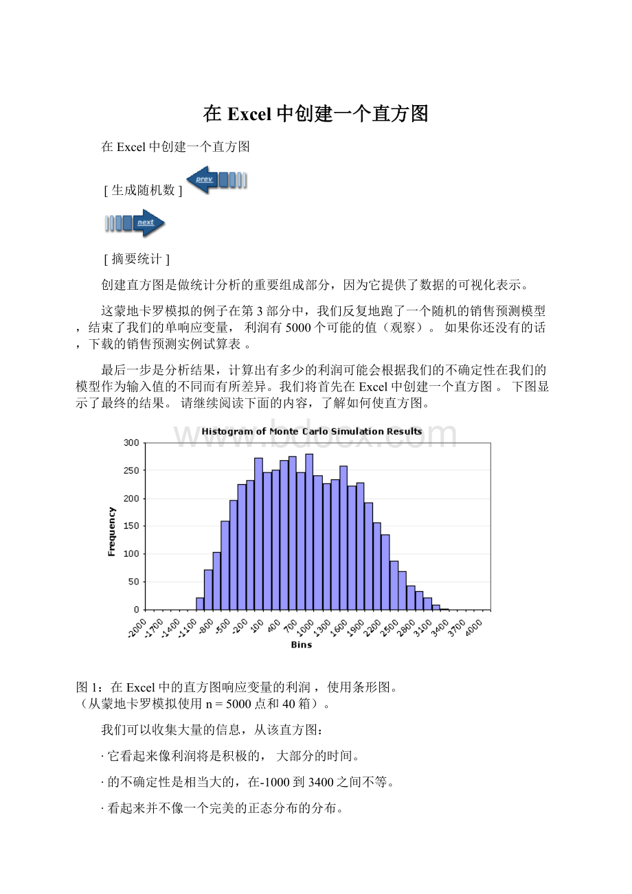
图1:
在Excel中的直方图响应变量的利润 ,使用条形图。
(从蒙地卡罗模拟使用 n=5000点和40箱)。
我们可以收集大量的信息,从该直方图:
∙它看起来像利润将是积极的, 大部分的时间。
∙的不确定性是相当大的,在-1000到3400之间不等。
∙看起来并不像一个完美的正态分布的分布。
∙似乎不存在是异常值,截断,多种模式,等
直方图讲述了一个好故事,但在许多情况下,我们要估计的概率是低于或高于一定的价值,或在一组的规格限制。
直接跳到下一个步骤在我们的分析中,将汇总统计数据,或继续阅读下面的内容,学习如何在Excel中创建直方图。
[ 生成随机数 ]
[ 摘要统计 ]
在Excel中创建一个直方图
方法1:
使用直方图工具,分析工具白。
这可能是最简单的方法,但你必须重新运行该工具,每个给你做一个新的模拟。
,你仍然需要创建一个数组箱(将在下面讨论)。
方法2:
在Excel中使用频率功能。
这是在电子表格中的销售预测的示例中所使用的方法。
我喜欢这种方法的原因之一是,你可以使直方图动态的,也就是说,每次您重新运行的MC模拟,图表将自动更新。
这是你如何做到这一点:
步骤1:
创建一个数组箱
下图显示了如何轻松地创建动态数组箱。
用于创建N个均匀间隔的数字的阵列,这是一个基本的技术。
要创建动态数组,输入下列公式:
B6 =$B$2
B7 =B6+($B$3-$B$2)/5
然后,复制单元格B7下降到B11
图2:
一个动态数组的5箱。
你创建的阵列箱后,你可以继续使用直方图的工具,或者您也可以继续进行下一个步骤。
步骤2:
使用Excel中的频率计算公式
下图是一个屏幕截图,例如MonteCarlo模拟。
我不打算详细解释FREQUENCY函数,因为你可以看它在Excel的帮助文件。
但是,有一点要记住的是,它是一个数组函数,并输入公式后,你将需要按Ctrl+Shift+Enter键。
需要注意的是仿真结果( 利润 )是在G 列中,有5000个数据点(点:
J5=COUNT(G:
G))。
数列的公式:
FREQUENCY(data_array中,bins_array)
a)选择单元格J8:
J48
b)输入数组公式:
{=FREQUENCY(G:
G,I8:
I48)}
C)按Ctrl+Shift+Enter组合
图3:
在Excel中创建一个动态缩放柱状图布局。
创建缩放直方图的
如果你想比较的概率分布直方图,你将需要扩展,使直方图曲线下的面积等于1的概率分布的特性之一。
的直方图通常包括落入各bin中的数据点,在y-轴的计数 ,但缩放后,将y轴的频率 (一个不那么易于解释的数目,可以在所有实用性不用担心)。
频率并不代表概率!
要扩展的直方图,可以使用下面的方法:
标度=(计数/点)/(BinSize的)
A)K8=(J8/$J$5)/($I$9-$I8美元)
b)复制细胞K8至K48
c)按F9强制重新计算(可能需要一段时间)
第3步:
创建柱状图
条形图,折线图或面积图:
创建直方图,只需创建一个条形图使用回收箱的标签和计数或比例列的值列。
提示:
要减少的酒吧之间的间距,用鼠标右键单击酒吧,然后选择“ 数据系列格式”。
..“。
然后进入“ 选项 ” 选项卡上 ,缩小差距 。
上面的图1这种方式创建的。
更灵活的柱状图
用条形图和面积图,其中一个问题是,在x-轴的数目只是标签 。
这可以使很难覆盖的数据使用不同数量的点或箱是各不相同的大小时,显示的适度规模。
但是,您可以使用散点图创建一个直方图。
后行箱的x值和计数或Y 值的比例列列,Y误差线的线向下延伸到x轴( 占 100%)。
您可以右键单击这些错误条改变线的宽度,颜色等。
图4:
直方图使用散点图和错误酒吧。
CreatingaHistograminExcel
[ GeneratingRandomNumbers ]
[ SummaryStatistics ]
Creatingahistogram isanessentialpartofdoingastatisticalanalysisbecauseitprovidesavisualrepresentationofdata.
InPart3ofthisMonteCarloSimulationexample,weiterativelyranastochastic salesforecastmodel toendupwith5000possiblevalues(observations)foroursingleresponsevariable, profit.Ifyouhaven'talready,downloadtheSalesForecastExampleSpreadsheet.
Thelaststepisto analyzetheresults tofigureouthowmuchtheprofitmightbeexpectedtovarybasedonouruncertaintyinthevaluesusedasinputsforourmodel.Wewillstartoffbycreatinga histograminExcel.Theimagebelowshowstheendresult.Keepreadingbelowtolearnhowtomakethehistogram.
Figure1:
AHistograminExcelfortheresponsevariable Profit,createdusingaBarChart.
(FromaMonteCarlosimulationusing n =5000pointsand40bins).
Wecangleanalotofinformationfromthishistogram:
∙Itlookslikeprofitwillbepositive, most ofthetime.
∙Theuncertaintyisquitelarge,varyingbetween-1000to3400.
∙ThedistributiondoesnotlooklikeaperfectNormaldistribution.
∙Theredoesn'tappeartobeoutliers,truncation,multiplemodes,etc.
The histogram tellsagoodstory,butinmanycases,wewanttoestimatethe probability ofbeingbeloworabovesomevalue,orbetweenasetofspecificationlimits.Toskipaheadtothenextstepinouranalysis,moveontoSummaryStatistics,orcontinuereadingbelowtolearnhowtocreatethehistograminExcel.
[ GeneratingRandomNumbers ]
[ SummaryStatistics ]
CreatingaHistograminExcel
Method1:
UsingtheHistogramToolintheAnalysisTool-Pak.
Thisisprobablytheeasiestmethod,butyouhavetore-runthetooleachtoyoudoanewsimulation.AND,youstillneedtocreateanarrayofbins(whichwillbediscussedbelow).
Method2:
UsingtheFREQUENCYfunctioninExcel.
Thisisthemethodusedinthespreadsheetforthesalesforecastexample.OneofthereasonsIlikethismethodisthatyoucanmakethehistogramdynamic,meaningthateverytimeyoure-runtheMCsimulation,thechartwillautomaticallyupdate.Thisishowyoudoit:
Step1:
Createanarrayof bins
Thefigurebelowshowshowtoeasilycreateadynamicarrayofbins.ThisisabasictechniqueforcreatinganarrayofNevenlyspacednumbers.
Tocreatethedynamicarray,enterthefollowingformulas:
B6 =$B$2
B7 =B6+($B$3-$B$2)/5
Then,copycellB7downtoB11
Figure2:
Adynamicarrayof5bins.
Afteryoucreatethearrayofbins,youcangoaheadandusetheHistogramtool,oryoucanproceedwiththenextstep.
Step2:
UseExcel's FREQUENCY formula
ThenextfigureisascreenshotfromtheexampleMonteCarlosimulation.I'mnotgoingtoexplaintheFREQUENCYfunctionindetailsinceyoucanlookitupintheExcel'shelpfile.But,onethingtorememberisthatitisanarrayfunction,andafteryouentertheformula,youwillneedtopressCtrl+Shift+Enter.Notethatthesimulationresults(Profit)areincolumn G andthereare5000datapoints(Points:
J5=COUNT(G:
G) ).
TheFormulaforthe Count column:
FREQUENCY(data_array,bins_array)
a)SelectcellsJ8:
J48
b)Enterthearrayformula:
{=FREQUENCY(G:
G,I8:
I48)}
c)PressCtrl+Shift+Enter
Figure3:
LayoutinExcelforCreatingaDynamicScaledHistogram.
CreatingaScaledHistogram
Ifyouwanttocompareyourhistogramwithaprobabilitydistribution,youwillneedtoscalethehistogramsothatthe areaunderthecurveisequalto1 (oneofthepropertiesofprobabilitydistributions).Histogramsnormallyincludethe count ofthedatapointsthatfallintoeachbinonthey-axis,butafterscaling,they-axiswillbethe frequency (anot-so-easy-to-interpretnumberthatinallpracticalityyoucanjustnotworryabout).Thefrequencydoesn'trepresentprobability!
Toscalethehistogram,usethefollowingmethod:
Scaled=(Count/Points)/(BinSize)
a)K8=(J8/$J$5)/($I$9-$I$8)
b)CopycellK8downtoK48
c)PressF9toforcearecalculation(maytakeawhile)
Step3:
Createthe Histogram Chart
BarChart,LineChart,orAreaChart:
Tocreatethehistogram,justcreateabarchartusingthe Bins columnforthe Labels andthe CountorScaled columnasthe Values. Tip:
Toreducethespacingbetweenthebars,right-clickonthebarsandselect"FormatDataSeries...".Thengotothe Options tabandreducethe Gap.Figure1abovewascreatedthisway.
AMoreFlexibleHistogramChart
Oneoftheproblemswithusingbarchartsandareachartsisthatthenumbersonthex-axisarejust labels.Thiscanmakeitverydifficulttooverlaydatathatusesadifferentnumberofpointsortoshowtheproperscalewhenbinsarenotallthesamesize.However,youCANusea scatterplot tocreateahistogram.Aftercreatingalineusingthe Bins columnforthe XValues and CountorScaled columnforthe YValues,addYErrorBars tothelinethatextenddowntothex-axis(bysettingthe Percentage to100%).Youcanright-clickontheseerrorbarstochangethelinewidths,color,etc.
Figure4:
ExampleHistogramCreatedUsingaScatterPlotandErrorBars.
 升级会员
升级会员 